Labs WMT VisualizeOutput: Difference between revisions
No edit summary |
m (added the CEM grid stack movie instructions) |
||
| Line 34: | Line 34: | ||
>> download the example file [[file:CEMgridstack.nc.zip|here]]<br> | >> download the example file [[file:CEMgridstack.nc.zip|here]]<br> | ||
>> Just like a single grid, create a plot of the x and y variables <br> | >> Just like a single grid, create a plot of the x and y variables <br> | ||
>> | >> Adapt the color table to an appropriate style <br> | ||
>> Clean up the labels, and make the captions understandable <br> | |||
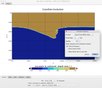
>> Once the mapview is to your liking, use export as animation under the Panoply main File tab <br> | |||
<br> | |||
[[File:Exporting movie.png|frameless|Export a movie from Panoply]] | |||
Revision as of 13:54, 13 July 2015
Visualize and Analyze WMT Model Output
CSDMS promotes standardized model output formats, i.e. NetCDF files.
NetCDF, Network Common Data Form, is developed by Unidata. NetCDF files are specifically designed for array-based scientific data and the format is adopted in many domains of the computational geosciences. Good information on NetCDf can be found here Unidata NetCDF info
One option to visualize NetCDF files is to use the Panoply package. This free open-source software developed by NASA allows easily visualization of 1) vector data, especially time-series data, and 2) gridded model output. It is also relatively straightforward to makes movies of grid stacks.
Download Panoply Software at NASA
Visualize a time series of data
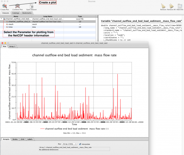
An example file is posted File:Channel outflow end bed load sediment mass flow rate.nc.zip. This file contains simulation output consisting of daily bedload flux data.
>> download this file, open it up with Panoply
>> the name of the file reflects the CSDMS standard name of the parameter saved in it. In this case it is a file of the model hydrotrend (which we used in theWMT tutorial). <>
The file lists sediment bedload, at the end of the river channel. And it has been recorded for 3650 days (or 10 years).
>> Select the parameters to plot against each other from the header information
>> Click on 'Create a Plot'
>> Using the menus under the Stroke, Grid and Labels Tabs you can manipulate what your plot looks like.
Visualize grid data
>> download the example file here.
>> Import the example file into Panoply
>> You will want to create a plot of the x and y variables
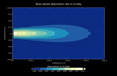
>> Plot it and play around with the axis labels and colormaps to adapt it to how you want the plot to look like.
>> Here is how mine came out

Make a movie of a stack of gridded output
>> download the example file File:CEMgridstack.nc.zip
>> Just like a single grid, create a plot of the x and y variables
>> Adapt the color table to an appropriate style
>> Clean up the labels, and make the captions understandable
>> Once the mapview is to your liking, use export as animation under the Panoply main File tab


